Instructure Canvas
UI Design (CSS overlay)
An LMS Canvas (Used by over 6 million+ people worldwide) that only always targeted the Education industry wanted to expand to the corporate market. They needed a new User Interface to accurately represent what the software was capable of delivering; this is where I came in to the mix as a User Interface Designer.
Time Frame
June 2022 - September 2022
Project Status
This project was done as part of my contract role at INFRAR3D INC. for the Instructure team in 2022.
Team
Me, Ali Kokulu, Hemansh Bhatia, Kevin Tieu
The Context/Background
Canvas as a platform has predominantly been used in educational environments. The Instructure team now wants to expand into the corporate world, and thus needs to showcase to stakeholders that the robust nature of the platform allows it to look and feel very different from what it originally is.
The Problem-Solution
To display the robustness of the platform by using custom CSS and JavaScript code to override the existing User Interface and replace it with a new design.
The Results
After user-testing the final product with multiple users, I was able to successfully prove that the new design fulfills all our goals.
4/5 users reported the new design being more user friendly and 5/5 users said that it catered better to the corporate audience.
The Goal was to make Canvas:
Redesigned User Interface
Redesign Callout 1: Global Navigation Redesign
BEFORE
Requirements:
Make the global menu more prominent.
Improve usability.
Modernize for a corporate audience.
Improve the experience for smaller screen sizes.
AFTER
Solution:
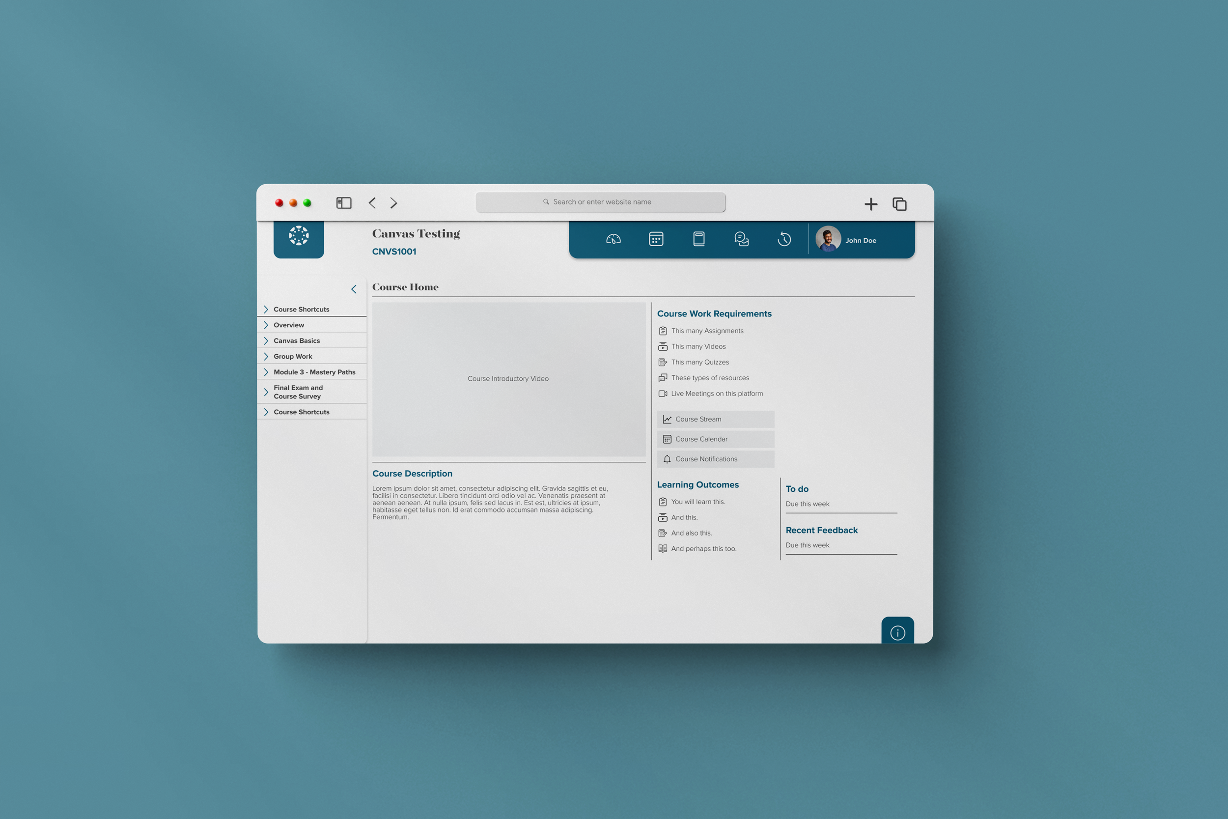
Moved the global menu to the top right of the screen, increasing visibility.
Separated the profile tab, and removed help from this menu giving it it’s own space on the bottom right of the screen, thereby reducing cognitive load based on Hick’s Law.
Replaced icons for a more modern look and feel.
On a smaller screen size, the menu retains it’s location in the top right.
Redesign Callout 2: Main Menu Redesign
BEFORE
Requirements:
Improve in-module navigation.
Modernize for a corporate audience.
Improve the experience for smaller screen sizes.
AFTER
Solution:
Created sub-menu’s within the main menu so that users are able to directly reach their desired page without having to go into a sub-page first.
Modernized UI, with selectors clearly visible.
Established a pattern for the main menu that was easily translated to smaller screens.
Usability Testing
5 users were made to test both versions of the User Interface (Original and Redesign).
Testing helped me realize the gaps in the new design and changes were made accordingly.
Post Testing Research - Survey Results
The users were sent a survey to complete after their participation to understand the results of the redesign. Results confirmed that the new design:
Felt more user-friendly
Catered better for a corporate audience.
Helped increase the visibility of the global menu.
Improves the main menu by adding access to the sub-menu items.
The takeaways and learnings from this project.
-
I learned to take on the responsibility to work as a solo UI designer on a project.
I learned to create and work around a design system.
I learned to better communicate functionality and design intent to developers.
-
I could have made the design more accessible for all audiences.
Reflection: I was limited to how things were originally designed on the back end and did not have control over everything.I could have followed the design system guidelines in a more coherent way.
Reflection: Since I was working on this project on a module-by-module basis, I had to created component on an as-needed basis. Not only did I have to redesign on top of an existing platform, but I also had to find and fix things that had minor problems to begin with.I should have followed a grid structure when I started.
Reflection: Not having done UI this extensively before, I made the mistake of starting the UI without having proper grids.UX first, UI later
Reflection: Having had to jump into redesigning the interface directly because of the nature of the project, it made the design process feel overly complicated. Not having wireframes to go off is a painful mistake.
-
I would have liked to speak to our clients at Instructure to understand their initial research. That kind of primary research would have been crucial to understanding in more detail what this software really needs to provide through the redesign.


